
A SnowFlare identity

Talent Community App
For the next few screens,
this site belongs to Talentify.
Brand philosophy
Talentify is an entertainment and talent community: short clips, live challenges between two or more talents on a Challenge Stage, audience voting on a clock, and weekly, monthly and annual tournaments. The identity had to carry fun competition without tipping into noise — so the mark is built from the T and a play button, and the palette keeps one loud colour and spends it carefully.
The system, in 5 parts
Open one. The page follows.


Anatomy
The T of Talentify plus a play button. Rotated six times around a centre, the two forms close into a star — a mark that reads as broadcast and as applause depending on where you meet it.

Variations


Clear space

Clear space stepped in multiples of the mark's own module, x1 through x5.
Misuse

Do not distort or blur the mark, recolour it or fill it with a gradient, outline it, or set the name in another typeface.
From the manual


Chapter 01 — The Mark
The T of Talentify and a play button, rotated into a six-point star. It reads as a burst at a glance and resolves into the letter on inspection — simple enough to work as an app tile, distinct enough not to be mistaken for the streaming services it sits next to.
Colour
Marks


Type Tajawal
Aa Bb Cc Dd Ee Ff Gg Hh Ii Jj Kk Ll Mm
Nn Oo Pp Qq Rr Ss Tt Uu Vv Ww Xx Yy Zz
1234567890
أ ب ت ث ج ح خ د ذ ر ز س ش ص ض ط ظ ع غ ف ق ك ل م ن ه و ي
In the world

Try it
The app, on your screen.
The delivered screens, wired together. Tap the interface the way you would on a phone — the tab bar, the comments, the challenge, the upload. It is a click-through of the design, not a running app.
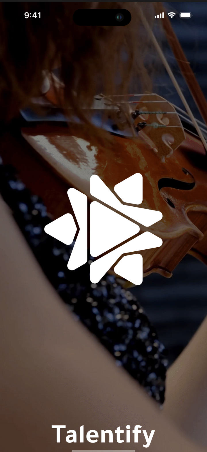
01Splash
Talentify — designed in-house at
SnowFlare